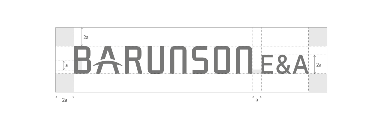
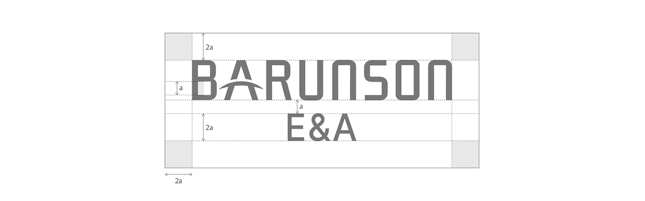
ENGLISH <

Barunson E&A's corporate identity (CI) symbolizes a bridge connecting the world and content.
Bridge A embodies Barunson E&A's vision to connect creators and contents with more audiences and a wider world.
BLACK, the primary color, means openness and expandability that Barunson E&A pursues.
Copyright ⓒ Barunson Entertainment & Arts Corp. All Rights Reserved. Created & Managed by Marvel Works.